By category · Shopping

The gallery is a shop window, not a catalogue

In retail your product photography is already doing the visual work. The job of the screenshot set is to answer one question the website cannot: why install the app at all.

Generate a retail gallery
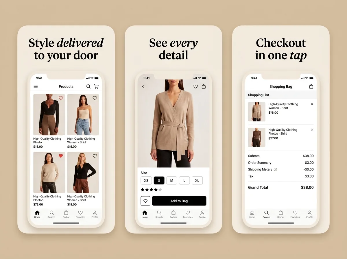
Vellum — Fashion commerce App Store screenshot set generated with App Mockup Generator AI
VellumFashion commerce
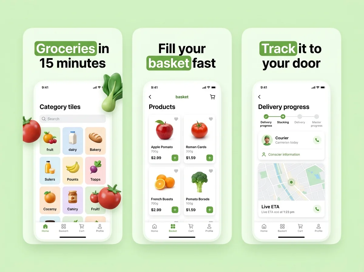
FreshCart — 15-minute grocery runs App Store screenshot set generated with App Mockup Generator AI
FreshCart15-minute grocery runs

A six-frame retail plan

Notice what is missing: there is no frame for “browse our 40 categories”.

  1. 1The category shotYour most photogenic merchandise, one benefit headline. This is your window display.
  2. 2The app-only advantageThe thing the website cannot do. Often the highest-leverage frame in the whole set.
  3. 3Search or discoveryHow someone finds the specific thing they came for.
  4. 4Checkout speedSaved cards, one-tap pay, address book. Removes the biggest hesitation.
  5. 5After the purchaseTracking, returns, reorder. Retail trust is largely post-purchase trust.
  6. 6Offer or nudgeFree delivery threshold, first-order discount, or a genuine current promotion.

Six rules specific to shopping apps

Your product photography is already the design

Retail is the one category where the screen inside the frame is more visually interesting than anything you could put around it. Keep the backdrop calm and let the merchandise carry the composition — Brand Match, not Bold Contrast.

Answer "why the app and not the website"

Almost everyone browsing your listing has already used your website. App-only prices, saved payment, order tracking, barcode scanning, push alerts for restocks — one of these should be a frame on its own.

Show the shortest path to a purchase

Search, product, checkout. Three frames showing how few steps it takes converts better than six showing category browsing, because the friction of checkout is the thing people are avoiding.

Show real inventory, not placeholder products

A grid of grey rectangles labelled "Product Name" is a rejection risk and a credibility problem. Use your actual catalogue, with real prices and real images.

Prices in the frame must be honest

A screenshot showing a discount you are not currently running, or a price that excludes a mandatory fee, is a policy problem on both stores as well as a consumer-protection one.

Localise the currency, not only the words

A German listing showing dollar prices tells a browser the app is not for them, even when the headline above it is in perfect German. Currency, sizing conventions and delivery language all live inside the framed screen.

Headlines that fit the category

Every one of these is about friction removed, not about the range you stock.

  • Checkout in one tap
  • App-only prices, every week
  • Free returns, no printer
  • Track it from the door
  • Delivered in 15 minutes
  • Save it now, buy it later

Retail listing questions

What should e-commerce app screenshots show?+

Your actual merchandise first, then the reason to use the app rather than the mobile website, then how short the path to checkout is. Category browsing screens are the least persuasive frames in a retail gallery and usually take up the most room.

Should shopping screenshots be busy or minimal?+

The frame around the device should be calm, because the screen inside it is already dense with product imagery. This is the category where a loud gradient backdrop actively fights the thing you are selling.

Can I show sale prices in screenshots?+

Only prices and promotions that are currently accurate for the person seeing them. A screenshot advertising a discount that has ended is a policy problem on both stores, and screenshots are reviewed alongside your binary.

Do I need different screenshots per country?+

For retail, more than most categories — currency, sizing conventions, delivery promises and available inventory all differ. Localising the headline while leaving dollar prices inside the frame undoes most of the benefit.

How many screenshots should a shopping app have?+

Five to seven. The gallery is a shop window, not a catalogue; a browser who is still scrolling at frame eight has already decided, one way or the other.

Currency and format handling per market is covered in localised screenshots.