Nobody downloads a tracker. They download the version of themselves it produces.
Health and fitness is the most visually competitive category in either store. Here is what separates a gallery that converts from one that lists features.
Generate a fitness galleryHealth sets from the gallery
Six principles for a health listing
Sell the change, not the tracker
Every fitness app tracks something. Nobody downloads a tracker — they download the version of themselves the tracker is supposed to produce. The first frame should show a state, not a dashboard.
Progress visuals beat feature lists
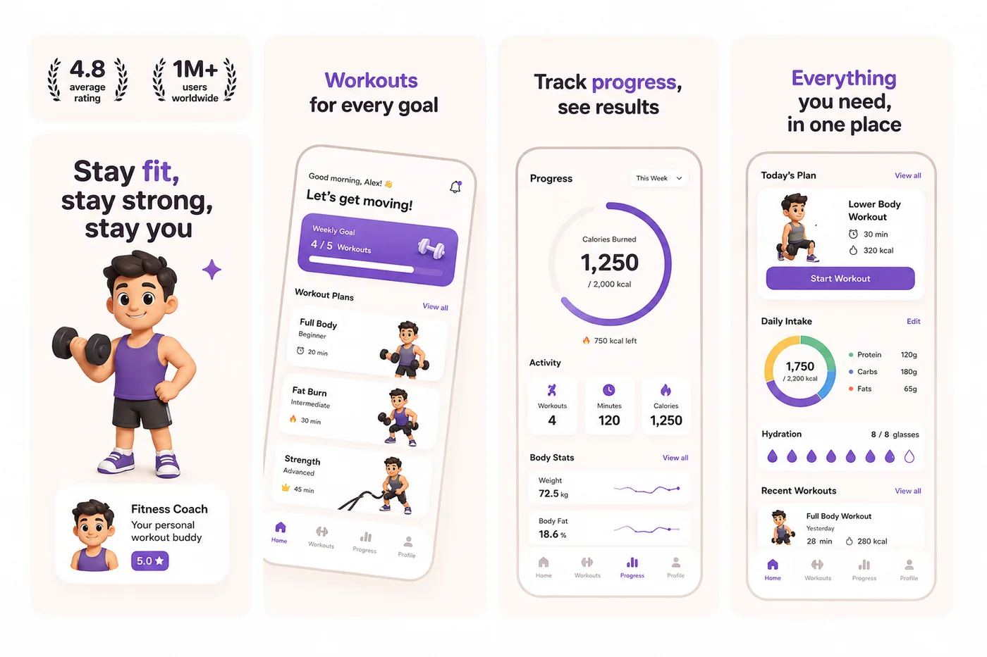
A filled ring, a streak, a chart bending the right way, a sleep score improving over a week. These read instantly at thumbnail size in a way a settings screen never will.
Energy is the category convention
Saturated gradients, high contrast and confident type are what this category looks like, and matching that is not a failure of imagination — it is how a browser identifies your listing as belonging to the thing they are looking for.
Show effort that is realistic
A 12-week transformation photo sets an expectation your onboarding cannot meet, and the retention cost shows up two days later. "Twenty minutes, no equipment" converts worse and retains far better.
Handle the body-image question deliberately
Whom you show, and how, is a positioning decision that changes who installs. Both stores also police content that shames or targets body image. Choose the framing on purpose rather than defaulting to stock imagery.
Never make a medical claim
"Lowers your blood pressure", "treats insomnia", "detects sleep apnoea" — health outcome claims require substantiation and a matching regulatory posture. Describe what the app measures, not what it cures.
Five sub-categories, five different first frames
“Health & Fitness” is one store category containing five unrelated products. They do not share a hero screenshot.
- Workout & training
- The workout in progress, then the week completed. Timers and rep counters read well; exercise libraries do not.
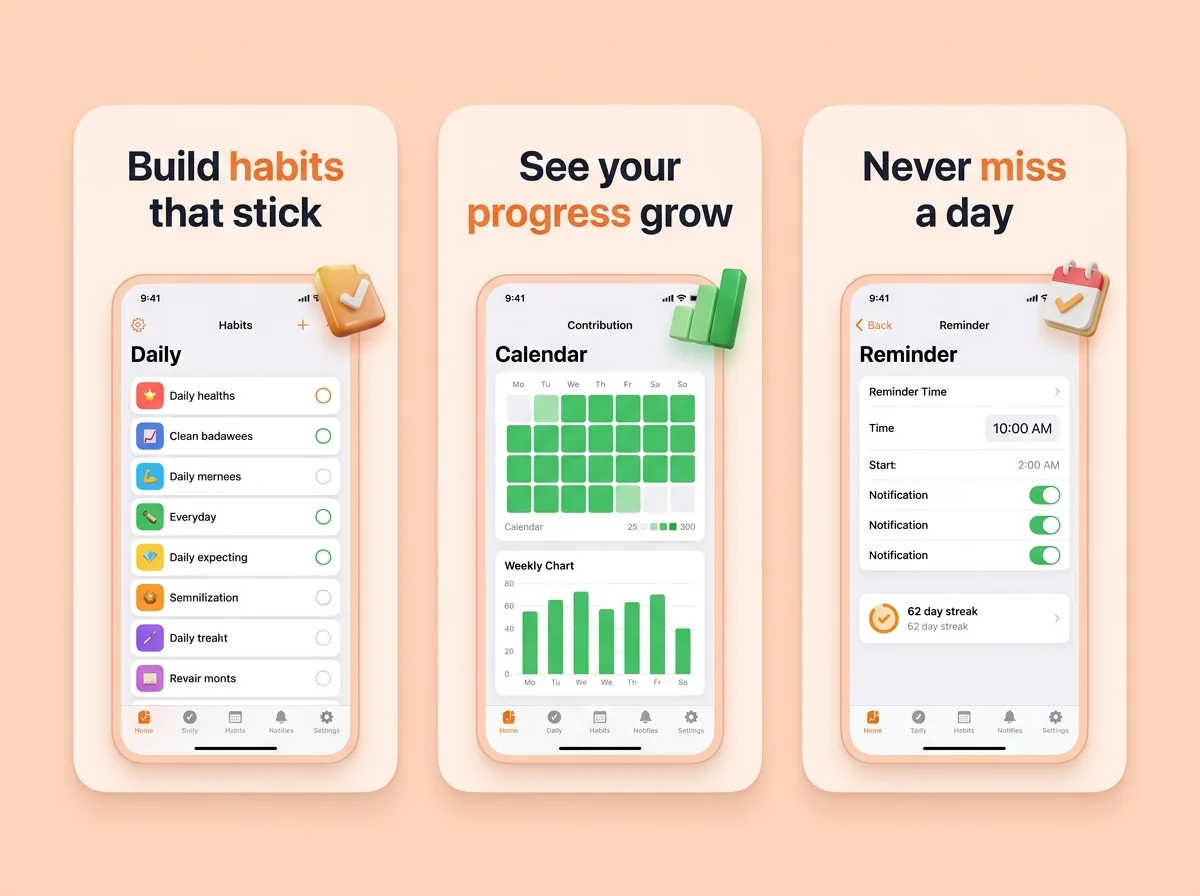
- Habit & streak
- The streak itself is the hero image. Frame two should answer "what happens when I miss a day" — the fear that stops people starting.
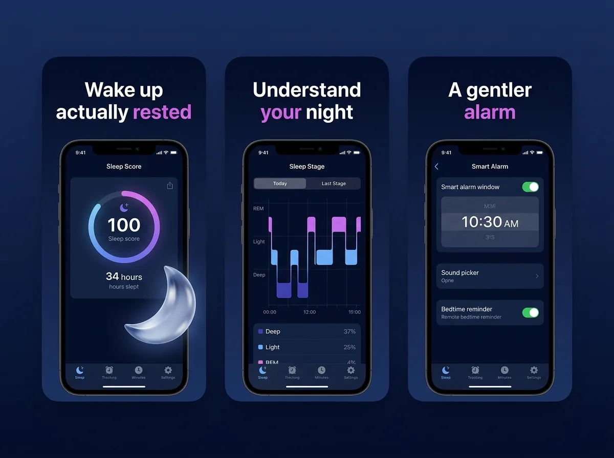
- Sleep
- Dark palettes, the score, and the morning report. Sleep apps are browsed at night on a dim screen; test your gallery in dark mode.
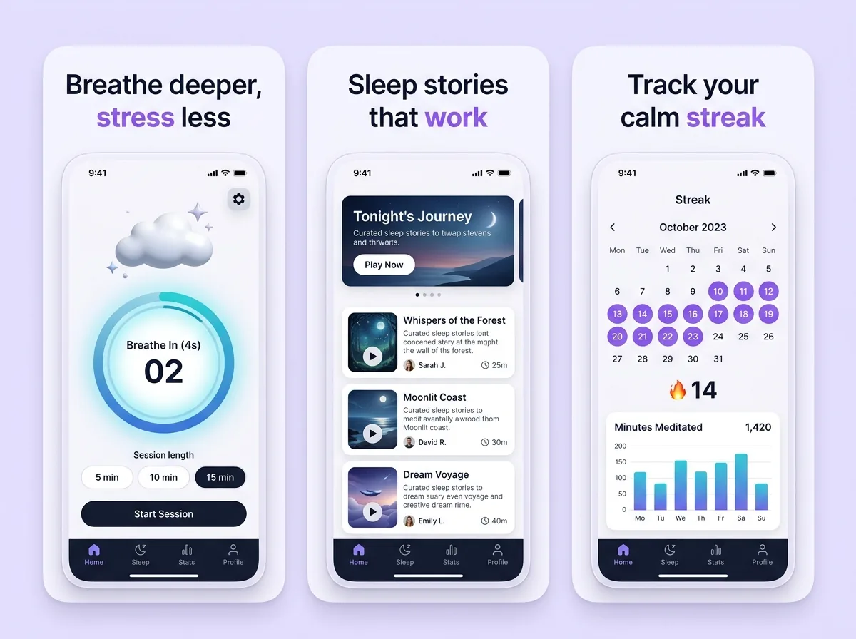
- Meditation & mental wellness
- Calm, spacious, low contrast — the one health sub-category where Minimal Light beats Bold Contrast outright.
- Nutrition & food logging
- Speed of logging is the entire pitch. Show the scan, the search, the three-tap entry.
Headlines that fit the category
Specific, achievable, and about a day rather than a transformation.
- “Your rings, closed by lunch”
- “Twenty minutes, no equipment”
- “Skip a day. Keep the streak.”
- “Fall asleep before the story ends”
- “Log a meal in three taps”
- “See the week you actually had”
Health listing questions
What makes a good fitness app screenshot?+
A visible state of progress in the first frame — a closed ring, a streak, a chart moving the right way — with a headline naming the change rather than the feature. Feature tours belong at frames four and five, once someone already wants the outcome.
Should I use before-and-after photos?+
Be careful. They set an expectation your onboarding cannot meet, they attract users who churn when week one is unremarkable, and both stores restrict content that targets body image. A specific, modest promise usually outperforms a dramatic one on retention.
What health claims are not allowed?+
Anything that reads as a medical outcome — treating, diagnosing or curing a condition — requires substantiation and, in many cases, a regulatory status you probably do not have. Describe what the app measures and helps you do, not what it fixes.
Do dark screenshots work for sleep apps?+
Yes, and they are usually right for the category — but check the gallery on a light store background too, and make sure headlines have enough contrast. Sleep apps are frequently browsed at night on a dimmed screen, which is a real usage condition worth testing against.
Which art direction fits fitness?+
Bold Contrast for training, workout and habit apps, where energy is the convention. Minimal Light for meditation and mental wellness, where calm is the product. Both are one selection in the generator.
Other categories
The first frame is a different job in every category. These two are the closest to this one.
Try it on your own screens
Three free credits, no card. Upload a few screens and see the finished set before deciding any of this matters.
Generate a screenshot set