Dense interfaces, tiny thumbnails
Productivity apps have the hardest screenshot problem in either store: the thing that makes the product good — density, structure, control — is exactly what disappears at 150 pixels wide. This is how to solve it.
Generate a productivity gallerySix problems and what to do instead
The interface is too dense to read
Crop into the part of the screen that matters instead of showing the whole app. A zoomed detail of one row, one card or one panel reads at thumbnail size; a full board never will.
Everything looks like a settings screen
Lead with a screen showing content, not configuration. Real project names, real note titles, real dates. An empty state dressed up as a feature is the most common productivity screenshot mistake.
The mobile app is not the product
For a companion app, sell the mobile job specifically: capture on the go, approve from anywhere, check a number in a meeting. Do not try to depict the whole desktop product on a phone canvas.
The audience is a team, not a person
B2B installs often start with one person evaluating for a team. Show collaboration explicitly — assignment, comments, shared views — because the evaluator is imagining their colleagues using it.
Nobody knows what it costs
If the app requires a paid account or a workspace to be useful, say so in the gallery. Hiding it wins installs that immediately churn and produces one-star reviews that are hard to recover from.
The category convention is restraint
Productivity buyers are trying to reduce noise. White space and quiet type signal that better than a saturated gradient does — Minimal Light is usually the right direction here.
Productivity sets from the gallery
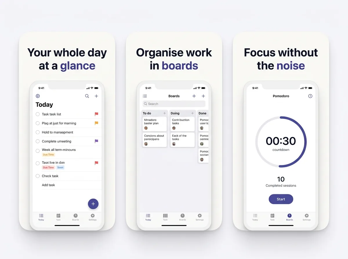
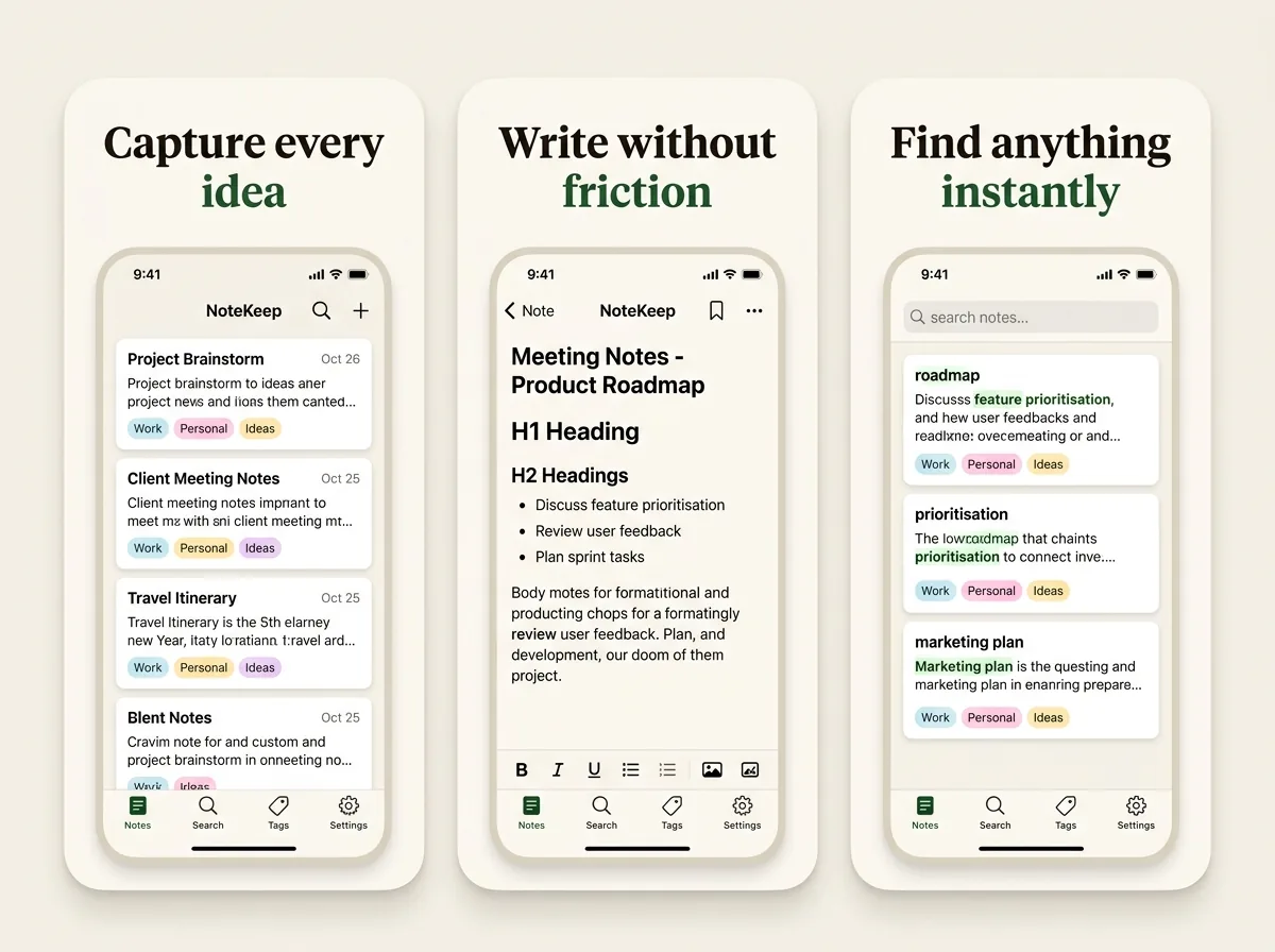
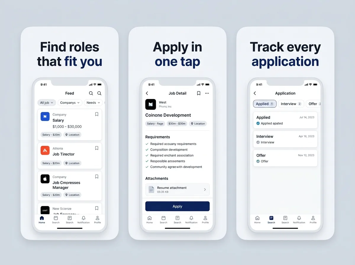
What each frame should carry
- 1The job, doneThe outcome state: inbox at zero, the week planned, the report ready.
- 2Speed of captureHow fast a thought, task or note gets in. This is the mobile-specific value.
- 3Finding things againSearch, filters, or the view that makes a large workspace navigable.
- 4CollaborationAssignment, comments or shared state, if there is a team involved.
- 5Integration or syncWhat it connects to. For a companion app this is the reassurance frame.
- 6Honest pricingFree tier, trial length, or workspace requirement. Better here than in a review.
Headlines that fit the category
Time reclaimed, not features listed.
- “Tomorrow, already planned”
- “Capture it before you forget”
- “Sixteen tabs became one list”
- “Find any note in two words”
- “Approve it from the queue”
- “Free for one project, always”
Productivity listing questions
How do I make a dense productivity UI readable in a screenshot?+
Stop showing the whole screen. Crop into the single element that carries the meaning — one task row, one card, one chart — and let the device frame imply the rest. A full board at 150 px wide is a grey rectangle.
What should a companion app for a desktop SaaS show?+
The mobile job, not the desktop product. Capture on the go, approve between meetings, check a number without opening a laptop. Trying to depict a full desktop workflow on a phone canvas produces screenshots that sell neither.
Should I mention the paywall in screenshots?+
Yes, if the app needs a paid account or an existing workspace to do anything. Installs won by hiding it churn within a day and leave one-star reviews complaining about exactly that, which costs more than the installs were worth.
Do B2B apps need store screenshots at all?+
Yes — even when most installs come from a link your customer sent, the gallery is the last thing seen before installing, and a listing that looks abandoned undermines a product someone is paying for.
Which art direction suits productivity apps?+
Minimal Light most of the time. The category convention is restraint, and white space communicates "this will not add noise to your day" more efficiently than any headline could.
Other categories
The first frame is a different job in every category. These two are the closest to this one.
Try it on your own screens
Three free credits, no card. Upload a few screens and see the finished set before deciding any of this matters.
Generate a screenshot set